How to – redesigning your blog in one evening
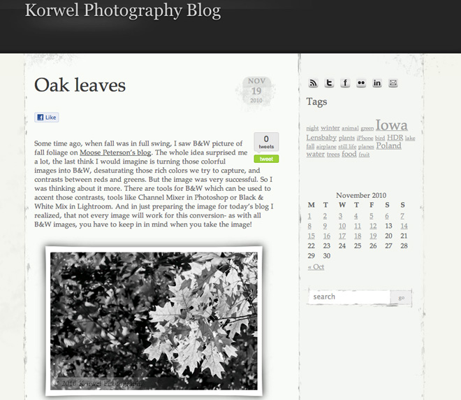
For those who check up on this blog in the evenings, including Friday- you already know. For the rest- the Korwel Photography web page page just got a cool new look. And you who visit the blog only in your RSS reader, here is a sneak preview of the new design.
It was high time to change the theme on the blog. For more then two years, I kept the original, depressingly dark theme and was just doing small changes and adding new things. Did it get messy? No, not really, but with more experience and thoughts what I like and don’t like about other pages I visited in this time period, I was ready for a change. Actually, I was thinking on re-designing the whole page for a while, almost a year now. But with no skills on my hand (not technical, really, but I am missing some designer eye), it was going nowhere. And then I decided to be far less ambitious. After all, there are thousands if not millions of ready WordPress themes- I have to be able to pick up something to suit my needs. Something I like. Something looking like it was done just for me.
I opened the three top Google results for “free WordPress themes” – WordPress page, Free WordPress Themes, and WordPress Theme Base. Although they offer some Advanced Search options by color, number of columns etc, I was not sure what I want. So I went through several pages on each site, to get an overview on what is available, but quickly felt a bit overwhelmed. What I needed was an idea what it really is what I am looking for. I decided to develop a list of features.
I looked again at some web pages and blogs I like, and came up with a number of items my new design should have and what I wanted to avoid. I wanted to keep the toned colors, shades of grays, but I wanted the post to be on light background with dark font. Not white on white theme with black letters though, it is just too sterile for me. I wanted the theme to be simple and clean, but with all features well distinguishable- like post Title, Tags etc. I wanted to have just two columns, one for post, and another for stuff like Search, Tags, Archive; otherwise, it would get messy fast. I have seen three column blogs well done, but I did not want to go this way.
When I had my top 10 choices, it crossed my mind that not all themes will be compatible with all the plug-ins I use, but with my all time favorite there was only one problem. The EXIF data was not displaying properly, but luckily my husband was capable of fixing quite quick. So I went with it.
The installation of new theme was far easier then I expected. You just download the theme to the hard drive and then upload it to WordPress through Appearance -> Themes. Before it went live, I could preview how it will look. It was a good time to customize the display even more.
First, I decided that most people visit my blog for one, particular post – from Facebook, Twitter or Google, so I limited the number of posts displayed at the time to just one (Settings -> Reading). It shortened the display drastically.
Then, I went to learn all about the Widgets and Sidebars and Footers (Appearance -> Widgets). Thanks to pure luck, I had at my disposal both Sidebar on the right of blog post, and the Footer. I cleaned the Sidebar, and left there only the most essential tools – Search, Social Media links, Tags (I think more people are exploring blog by tags then by Categories, and if not – post Category can be reached from below the post) and Archive. I like the Archive displayed in the form of Calendar more then the drop-down list, so I added it instead (Calendar widget). And you do it by just dragging the Widget onto the appropriate bar. Cannot be simpler, assuming your theme has those bars in the design. It can be done if the author of the theme did not think of for example adding widgets to Footer, but it requires a more advanced knowledge, or Google search skills ;).
With simple Sidebar, I went wild in the Footer. I assumed if somebody scrolls down there, the person is really interested in exploring the blog some more. Here is where I added Recent Posts, Recent Comments and Twitter stream.
The one drawback of the theme is that the images got further reduced in size. Although I really like the white frame around them. Luckily, with Lightbox 2 plug-in, images are clickable and can be displayed larger.
Now, I need to get ready the Pages for the rest of stuff- Links, Affiliates and so on.
Overall, the whole process took just one evening and was almost painless. I wish I did not wait that long.
Maybe upcoming long Holiday weekend is the time to redesign your blog, too?
Share your thoughts on my new design or show how your blog looks like in the Comments section.
