
Review of “Through the woods” workflow
I have love-hate relationship with Lightroom presets. I used to like them and applied them a lot early, when I was still …
I have love-hate relationship with Lightroom presets. I used to like them and applied them a lot early, when I was still …

One of the most clever and probably seriously underutilized functions of Lightroom are Develop Presets. Almost every Lightroom module has a possibility …
I am sure there are still serious photographers out there who are not using Lightroom. They do not make themselves a favor. …

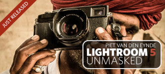
Books devoted to specific versions of software tend to have short shelf life. After all, the new version of programs like Lightroom …

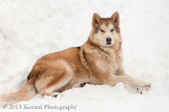
While over the years of publishing my images on this blog my opinion about watermarking the images and the need for it …
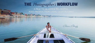
About the e-book Dave Delnea is commercial and advertising photographer from Vancouver, Canada. When he is not producing sports, lifestyle and travel …
How is everybody doing with their New Year resolutions 10 day later? My “project 365” is still alive, although almost ended up …
UPDATE: Only $20 during the month of January when you use the code photowork33jan. Start New Year from organizing your images with …